Color Trends – Pantone Color Report Spring 2012
I’m a little obsessed with color. It goes with the designer / photographer territory. My thesis paper was on color and it’s application to advertising. I day dream about painting my walls. I plan out outfit color combos in my head. I look through my pantone color guide just for fun. The paint swatch area of home depot makes me happier than it probably should. It’s an addiction.
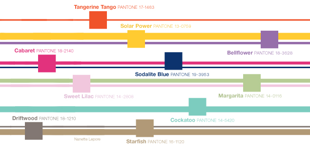
Many of the color decisions the fashion and design worlds make are based on Pantone’s fashion color reports which are compiled by top designers and what’s shown at Fashion Week. Below are the colors for the Spring 2012 fashion report (image from Pantone.com, you can download the full report here).

The cool thing is once you see the report of colors you’ll start to see them everywhere. Pantone is the guide to color for almost all creative industries (fashion, interior design, graphic design, product development), and each of these industries takes cues from the reports Pantone puts out each season. The most notable is how it affects the fashion industry.

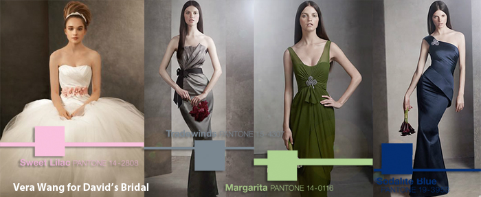
Here is a sample of Vera Wang’s Spring line for David’s Bridal. While the colors aren’t exact you can definitely see the influence they have on the collection. (Images from DavidsBridal.com).

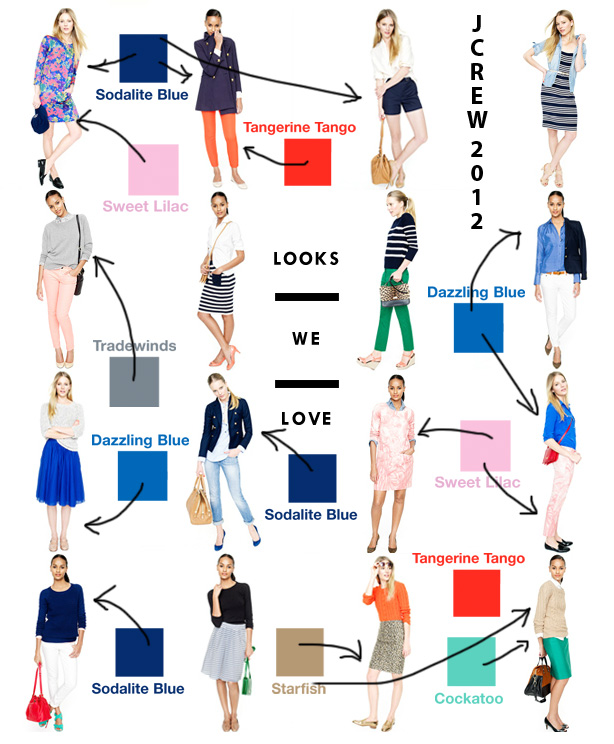
I’m so glad I found this image of J.Crew’s Spring 2012 collection. It really shows how the colors influence the whole collection and how they can be successfully used together. I’m actually really excited about the colors for the spring. There are some classics like the sodalite blue and starfish, but tangerine and cockatoo are fun and spunky (I could totally see them together with sodalite in a men’s striped tie).
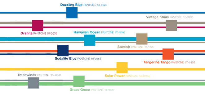
Pantone has also put together a similar color palette for men’s fashion trends. Some of these colors can be seen in the women’s collections above, the men’s collection adds a few more solid, manly colors like dazzling blue, granita, vintage khaki, and tradewinds.

So that’s that, my little heart is fluttering with joy at these new colors. I’m looking forward to seeing how they’re used throughout all the creative industries.

What colors from the Pantone Spring 2012 collection are your favorites?
Have you already seen these colors showing their pretty little faces in stores?
