Facebook Pages Are Changing
Facebook has been changing everyone’s personal pages over to the timeline layout for the last few weeks. I’ve heard mixed feelings about it but like everything Facebook does people hate it at first cause it’s change from the norm and then a few weeks/months later get used to it and forget it was ever an issue. Shortly (March 30th) Facebook will also change over all it’s business Pages to a timeline style layout, if you manage a page, you’ve seen all the tours and prompting to change.
As a business I really like the new layout. They’re offering some really cool things, here’s a run down:
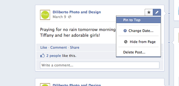
1. Pin A Post

You can now tack a post to the top of your page. This is great if your running a promotion and you don’t want to have the post about it get lost at the bottom of your timeline as you post new things. Just pin it to the top of your page!
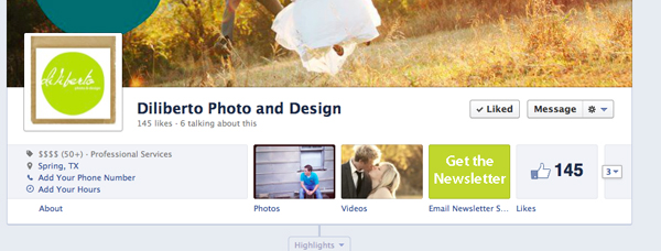
2.Photos, Likes and Apps Have Moved (And Are Awesome)

I really appreciate that photos, likes, and apps are at the top of the page with a larger graphic visual, instead of at the side as a text link with a teeny icon. Ie. You can actually find them!
![]()
They’re also WAY more customizable. You can customize what shows up first (I’ve chosen photos, videos, and our email newsletter sign up) by swapping positions. AND, drum roll…….you can change the icon photo. I did a quick “get the newsletter” button to check it out. Your new icon photos need to be 111×74 pixels and less than 5mb, otherwise Facebook will re-size them.
3. Edit & Highlight Stories

I also love, love, love that I can edit the timeline and highlight more important stories. If you highlight a story on your new timeline it will make it HUGE and beautiful so it stretches across the width of your timeline.
4. Private Messages
People can now private message you through your facebook page. This is a great and long awaited addition.
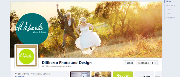
5. Three Cheers for Cover Photos

As a photographer I love the new cover photo (really, who doesn’t)! But there are some things to take note of. Make sure you create your cover photo at 851 px by 315 px. At any other size Facebook will re-size your image for you and things can get wonky. Also make sure you don’t put anything too crucial in that bottom left corner as your profile picture/icon photo will cover it up.
I should also note that I am not in love with either of my cover page or profile picture, I just wanted to get something up there so I could show you all what was going on with the Facebook page changes.
6. Additional Changes
There are several other additional changes that I haven’t highlighted here. HUGE changes to the admin panel, also the posts others make on your wall…er…timeline looks different.
The best way to adjust to all these changes is to do as much research and reading as you can and then just get in there and play around with settings and adjustments. Go explore and see what’s there. You have until March 30th to experiment and play with the new layout until you’re forced to make it live. Take advantage of the opportunity.

[…] homeaboutphotographyFor the Love of CouplesTo Be WedSeniorsFamilies & KidsBumps & BabesCorporate & Real EstateFusion VideosdesignEvent & Party DesignsPhotography DesignsPromotional & AdvertisingLogos & BrandingWebsite Designmenusphotography sessionsproducts & printsbooks and albumscards & announcementscorporate designevent & party designblogcontactclientsannika-seniorbethia & joelcorey-senior 2012ezraJason & KendraKyra and Kevinnatashaoak ridge homecomingtaylor familythe nutcrackerrebecca-senior 2012josh hundl-senior 2012shopping cart « The Suspense Is Killing Me Facebook Pages Are Changing » […]